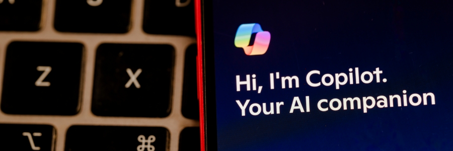
Are you ready to unlock the power of artificial intelligence (AI) for your small or medium-sized business (SMB)? Microsoft 365 Copilot can help you increase productivity, reduce costs, and gain a competitive edge. With three new flexible purchasing options, it's easier than ever to bring Copilot into your SMB and start experiencing the benefits of AI.
What is Microsoft 365 Copilot?
Microsoft 365 Copilot integrates advanced AI tools directly into familiar Microsoft applications such as Word, Excel, PowerPoint, Outlook, and Teams.
Microsoft 365 Copilot offers a suite of tools powered by artificial intelligence (AI) that can revolutionize the way you work. From automating tasks to generating creative content, Copilot can help your team achieve more in less time. Discover three new ways to purchase Copilot and unlock its potential for your small or medium-sized business (SMB).
What is Microsoft 365 Copilot?
Microsoft 365 Copilot integrates advanced AI tools directly into familiar Microsoft applications such as Word, Excel, PowerPoint, Outlook, and Teams.
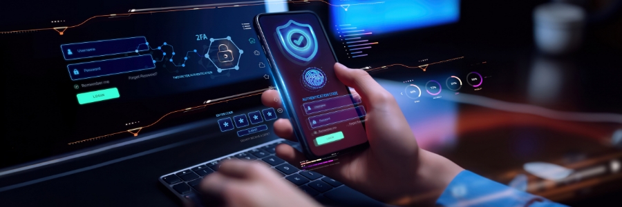
Cybercrime is more sophisticated and persistent than ever, putting small businesses at significant risk of attack. The new year offers a fresh start, and what better way to begin than by prioritizing your business’s cybersecurity? Below are seven actionable resolutions to help you protect your data, your customers, and your reputation in the coming year.
During the holiday season, skipping the crowds and shopping from your computer or phone is undeniably convenient, but this ease of access comes with potential pitfalls. Cybercriminals ramp up their tactics, preying on unsuspecting shoppers with scams, fake deals, and phishing attempts.
Copilot Pro and Microsoft 365 Copilot are two cutting-edge artificial intelligence (AI) assistants that are shaping the future of work by streamlining tasks and boosting productivity. In this blog post, we'll delve into their features, benefits, and limitations to help you choose the right AI assistant for your business's needs.