Artificial intelligence (AI) is revolutionizing the modern workplace. With the rise of powerful AI assistants such as Copilot Pro and Microsoft 365 Copilot, individuals and businesses can further streamline tasks and boost productivity. But which tool is the right fit for you? Let’s explore both options to help you make an informed decision.
The holiday season brings tons of opportunities for retailers to thrive, but it also opens the door to increased cyber risks. With so many people shopping and transactions spiking, cybercriminals see this period as a perfect chance to strike. From sneaky phishing attempts to full-blown ransomware attacks, your business could be at risk.
During the holidays, retailers can feel overwhelmed by the number of tasks they need to complete. But while keeping up with the holiday rush, they also need to be vigilant about potential cyberthreats. With more customers shopping online and increased payment activity, there are several risks that can affect retailers during this time.
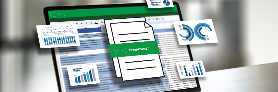
Want to make your Excel data easier to grasp with a quick look? Using charts and sparklines can transform raw numbers into clear, insightful visuals. This article will guide you through setting up and editing charts and sparklines.
What are Excel charts?
Excel charts are visual representations of data that help you quickly identify trends, make comparisons, and gain insights without needing to analyze rows and columns.
Visualizing data is key to making informed business decisions, and Excel’s chart and sparkline tools make it easy to turn numbers into clear visuals. In this guide, you’ll learn the basics of using charts and sparklines in Excel to highlight trends, compare data, and better understand your spreadsheet insights.